Data Grid
Introduction
Table of Contents
The DataGrid is a control that ships with .NET 4.0 by default and provides support for filtering, grouping, sorting and other standard features that you would expect of a DataGrid.
MahApps.Metro uses the default DataGrid control but applies a style to it by default. It also contains a Checkbox style for DataGridCheckBoxColumn as well as a custom DataGridNumberNumericUpDownColumn.
Getting Started
In order for the style to be applied, you will have to include references to the Styles/Controls resource dictionary in your App.xaml and the namespace xmlns:controls="clr-namespace:MahApps.Metro.Controls;assembly=MahApps.Metro" in the window you are using. Instructions on how to do this can be found in the Quick Start Guide.
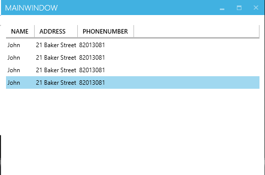
After including the references, any DataGrid that you place in XAML will follow the style displayed above.
<DataGrid ItemsSource="{Binding People}">

</DataGrid>

Alternative Style
MahApps.Metro also provides an alternative style, AzureDataGrid that attempts to mimic the DataGrid found on Microsoft Azure. To use it instead of the default style, simple set the DataGrid’s Style property to {StaticResource AzureDataGrid. As usual, make sure that you have your references defined.
<DataGrid ItemsSource="{Binding People}" Margin="10,20,10,0"
                  AutoGenerateColumns="True"
                  Style="{StaticResource AzureDataGrid}">

</DataGrid>
The AzureDataGrid style will look something like this:

DataGrid Numeric Updown Control
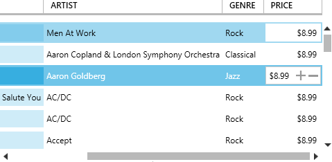
In addition to styling the DataGrid, MahApps.Metro also provides a control that allows users to add a NumericUpDown as one of their DataGrid’s columns. To add the custom column to your DataGrid, add DataGridNumericUpDownColumn under the MahApps namespace to your DataGrid.Columns properties. Be sure to set AutoGenerateColumns to False if you have not already done so.
<DataGrid ItemsSource="{Binding Path=Albums}"
                  Grid.Row="0"
                  AutoGenerateColumns="False">
            <DataGrid.Columns>
                <DataGridTextColumn Header="Genre"
                                    Binding="{Binding Genre.Name}" />
                <controls:DataGridNumericUpDownColumn Header="Price"
                                                      Binding="{Binding Price}"
                                                      StringFormat="C"
                                                      Minimum="0" />
            </DataGrid.Columns>
        </DataGrid>
The end result will look something like this:

DataGrid Checkbox
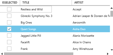
Lastly, MahApps.Metro provides an ElementStyle for the DataGridCheckBoxColumn. In order to apply the style, you will have to set the ElementStyle property of the DataGridCheckBoxColumn to {DynamicResource MetroDataGridCheckBox} as shown in the code sample below.
<DataGrid ItemsSource="{Binding Path=Albums}"
                  Grid.Row="0"
                  AutoGenerateColumns="False">
            <DataGrid.Columns>
                <DataGridCheckBoxColumn ElementStyle="{DynamicResource MetroDataGridCheckBox}"
                                        EditingElementStyle="{DynamicResource MetroDataGridCheckBox}"
                                        Header="IsSelected"
                                        Binding="{Binding RelativeSource={RelativeSource AncestorType=DataGridRow}, Path=IsSelected, Mode=OneWay}"
                                        />
            </DataGrid.Columns>
        </DataGrid>
The end result will look something like this:

